Stylish hair, created with care, on a site that finally matches the salon.
bei London has a perfect 5.0 from 2,785 reviews, but its website had no working https and a stock template. The redesign keeps things calm and editorial: their own salon photos, the founders' story, a tabbed price list and Fresha booking one tap away.
What we built.
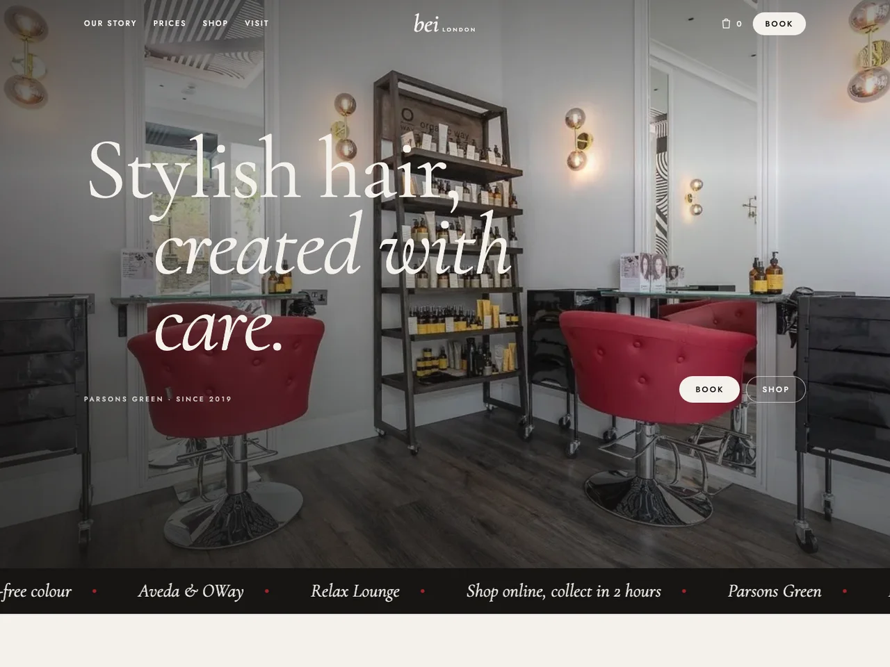
Editorial hero
The salon's red chairs and mirrors, with the name set in a fine italic serif.
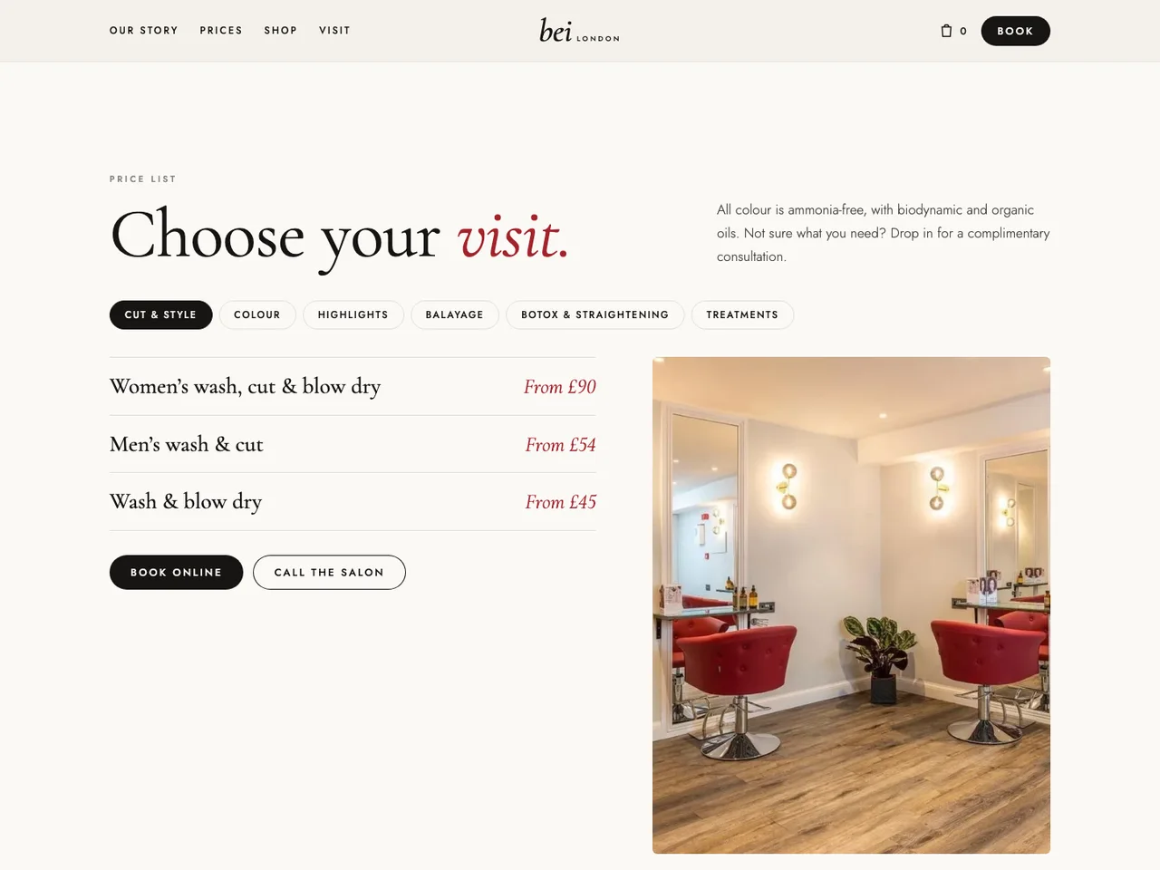
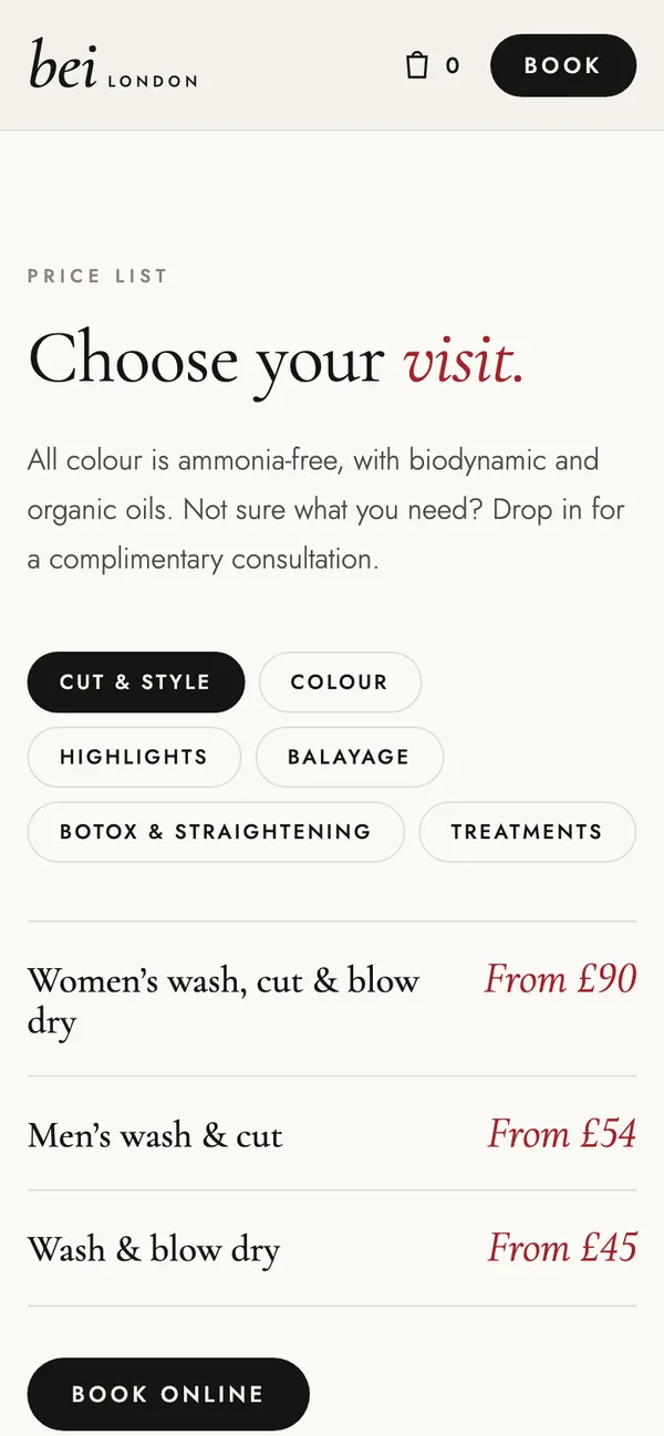
Tabbed price list
Cut & style, colour, highlights, balayage, Botox & straightening, treatments.
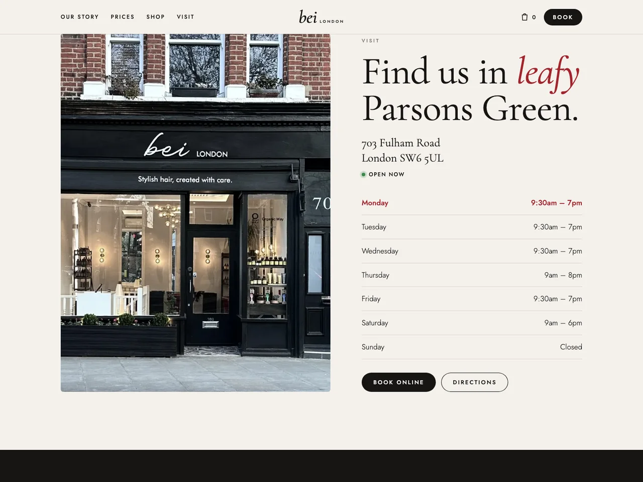
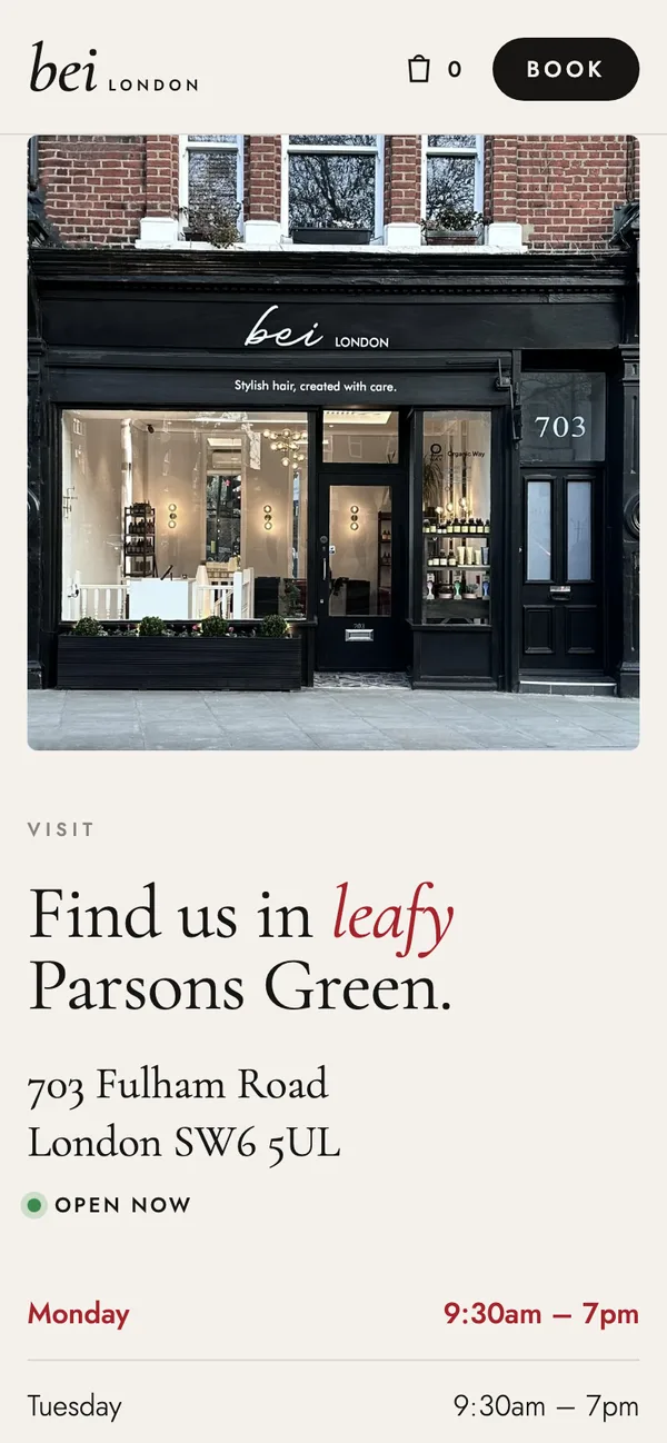
Story, shop and visit
Two friends and one Fulham Road salon, Aveda and OWay retail, hours and directions.
The screens.
Designed for the screen it's read on.
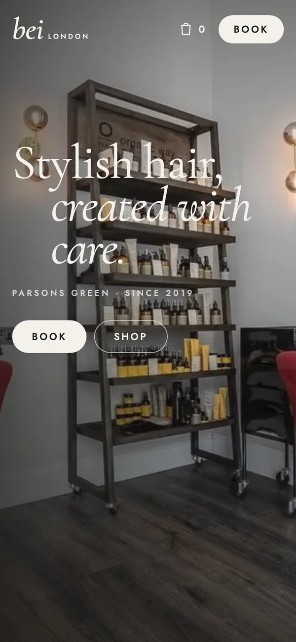
Most visits to a local business start on a phone, so every section is laid out for one first: the opening screen fits without scrolling, buttons sit where a thumb lands, and nothing runs off the side.
What makes it work.
Cormorant and Jost
A high-contrast serif with a clean geometric sans.
Their real photography
Salon, shopfront and Relax Lounge photos from their own gallery.
Real prices
Every price comes from their own pricing page.
Booking stays on Fresha
No new system to learn: every Book button goes to their live Fresha page.
Ready for Google, and for AI search.
Every site we launch is optimised three ways, so customers find it however they search.
Search engines
Fast pages, proper headings, local business schema, and your name, address and phone exactly as Google lists them.
AI assistants
Plain, factual sentences with real numbers that ChatGPT, Gemini and Perplexity can read, quote and link back to.
Answer boxes & voice
The questions customers actually ask, answered directly on the page in a sentence or two.
- Prices, hours and the 703 Fulham Road address written as text, not images, so search engines and AI can read them.
- A clear answer to “do you use ammonia-free colour?” right on the price list.
- Hair salon schema with the rating, opening hours and Parsons Green location.