A site that does one job well: get someone through the door.
Brook Cafe is a no-fuss, honest breakfast spot on Brook Road, Wood Green — the kind of place that runs on regulars and walk-ins, not online orders. We built a private preview site around what actually gets someone in the door: real opening hours, the real address on a live map, and the one fact that sells the place — a full breakfast and a drink for under £7 — instead of a scanned PDF menu or a checkout button nobody needed.
One platform, three jobs to do.
Hero
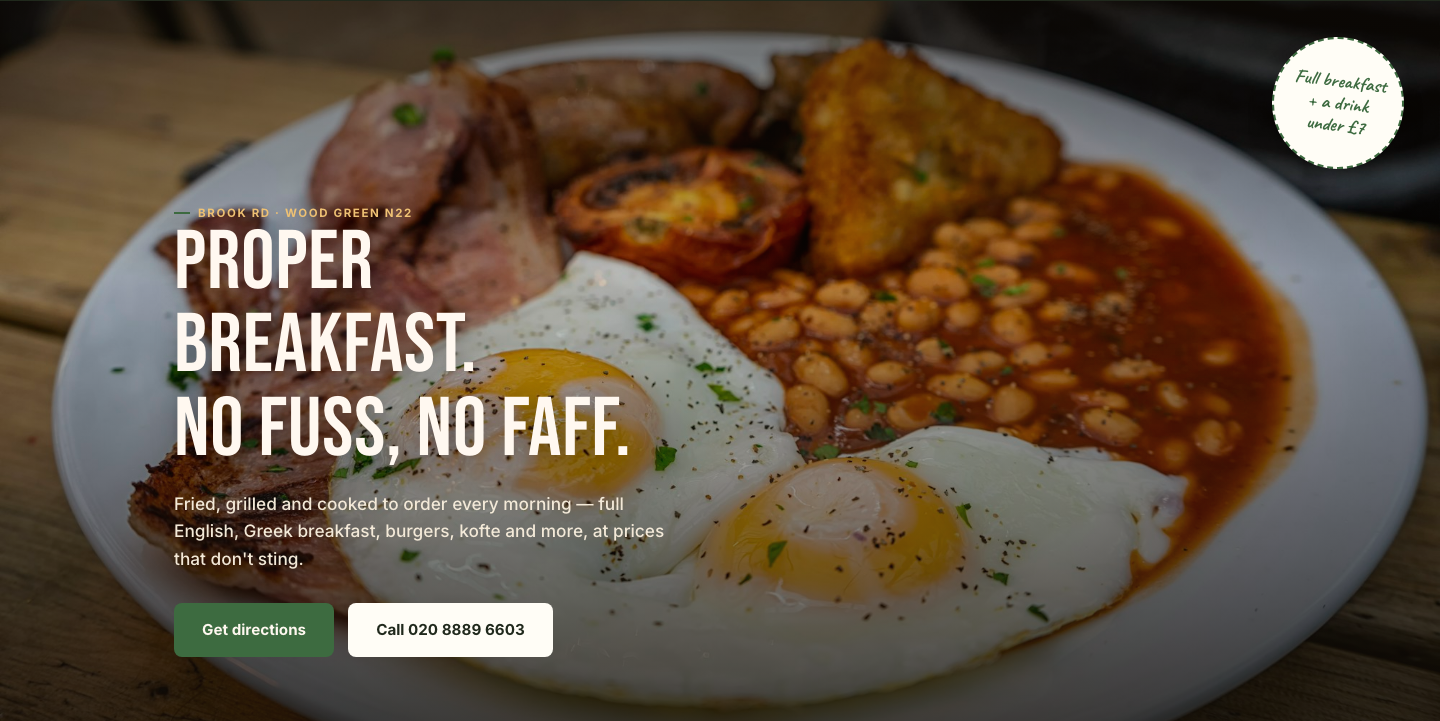
A full-bleed breakfast photo with a hand-drawn "under £7" stamp badge and two clear actions — get directions or call — so there's no menu-browsing detour before someone can find the door.
Menu highlights
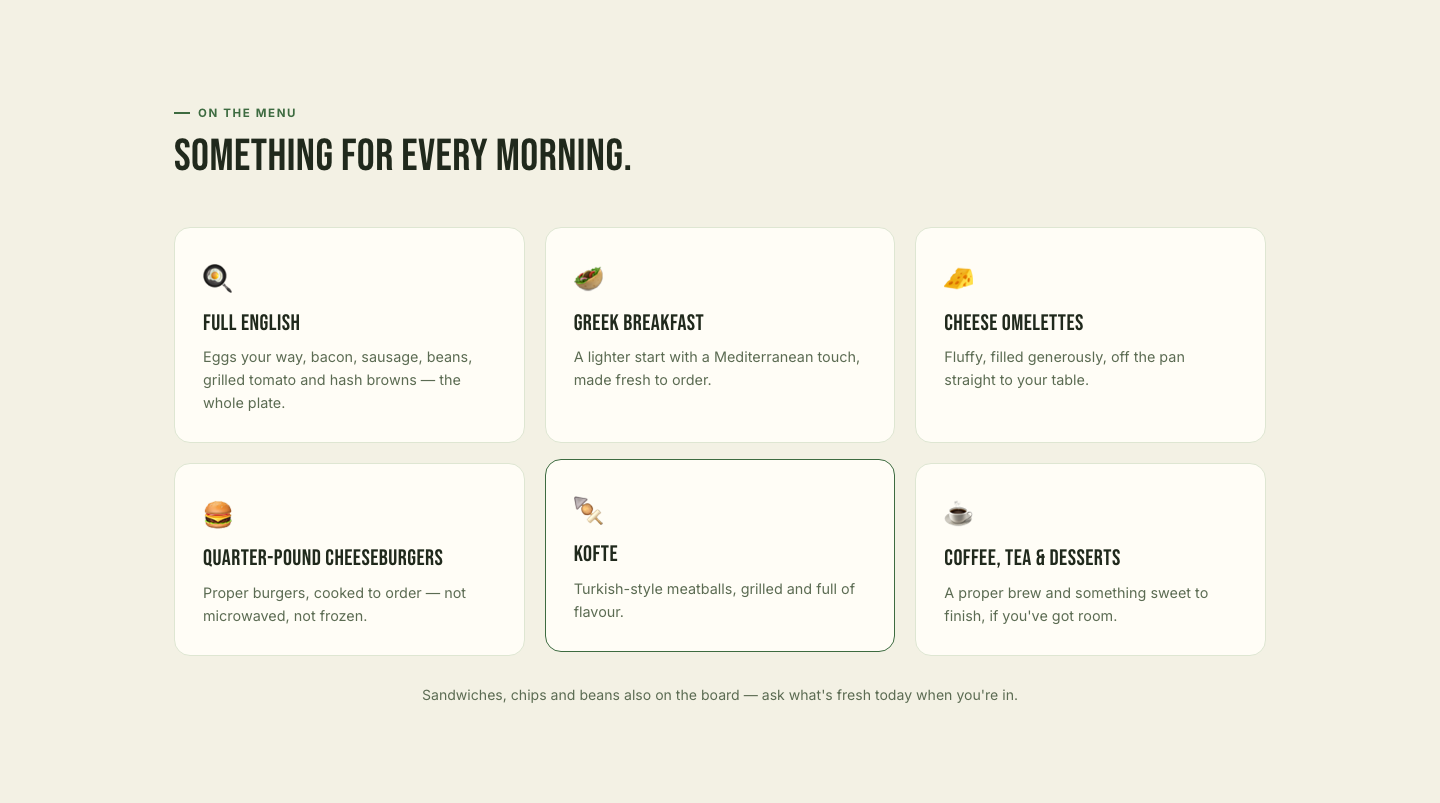
Six illustrated categories — Full English, Greek breakfast, omelettes, burgers, kofte, coffee and desserts — with no prices or ordering, since everything here is walk-in and cooked to order.
Story
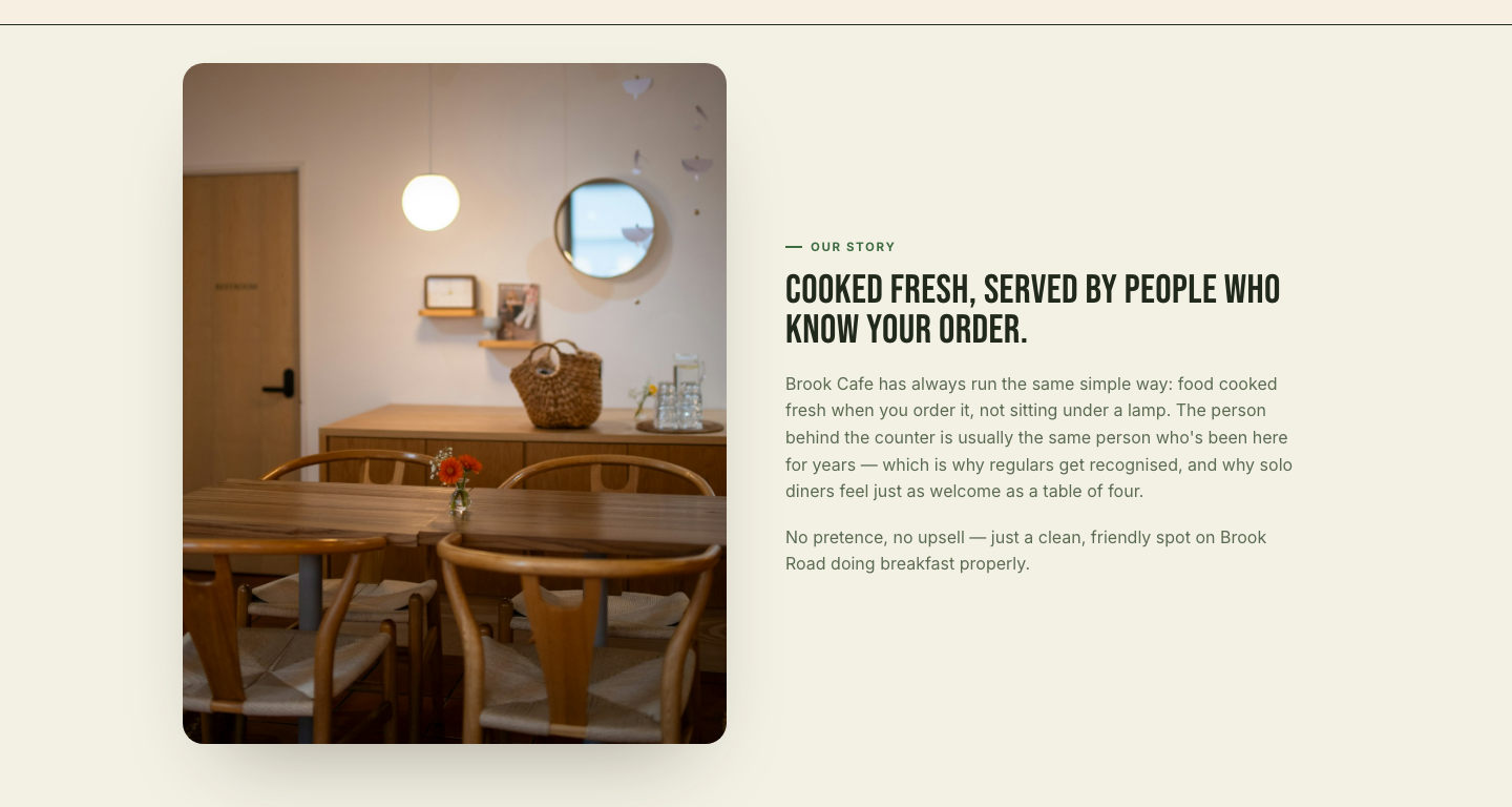
A short, honest section on why regulars keep coming back, paired with a warm interior photo instead of generic stock food shots.
Hours & location
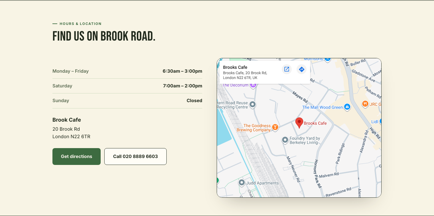
A live embedded map, full opening hours and one-tap directions — the actual job the site needs to do for a business that lives on foot traffic.
From first search to first day live.
What makes it work.
Real data, not placeholder copy
Address, phone number and opening hours were pulled directly from Brook Cafe's own existing listing rather than invented, so the preview is accurate from day one.
A signature built from the real pitch
The one fact that actually sells this place — a full breakfast and a drink for under £7 — became a hand-drawn stamp badge instead of getting buried in body copy.
No checkout, on purpose
This is a walk-in cafe, not an online kitchen — every button leads to directions or a phone call, never a cart.
A palette that's actually theirs
Swapped the first pass's brick-and-cream look for greens and golden yellow once it was clear that was closer to how the client already presents the brand.
Condensed signage type
A tall, condensed display face reads like hand-painted shopfront lettering, paired with a plain, readable body face for the parts people actually need to scan.
Locked behind a password until it's ready
A simple session-gated preview so the client can review privately before anything goes near search engines.