An aesthetic clinic with real edge, built for Camden rather than a generic postcode.
Camden Beauty Spa has been on Camden High Street since 2013, and their real site already carries a genuine 2017 London Beauty Awards win and the line "beauty goes beyond the surface." We kept both, and pitched a direction that fits Camden's own alternative-market energy rather than the soft pastel look most beauty-clinic sites default to — dark, bold, and led by a real award instead of an invented trust badge.
One platform, three jobs to do.
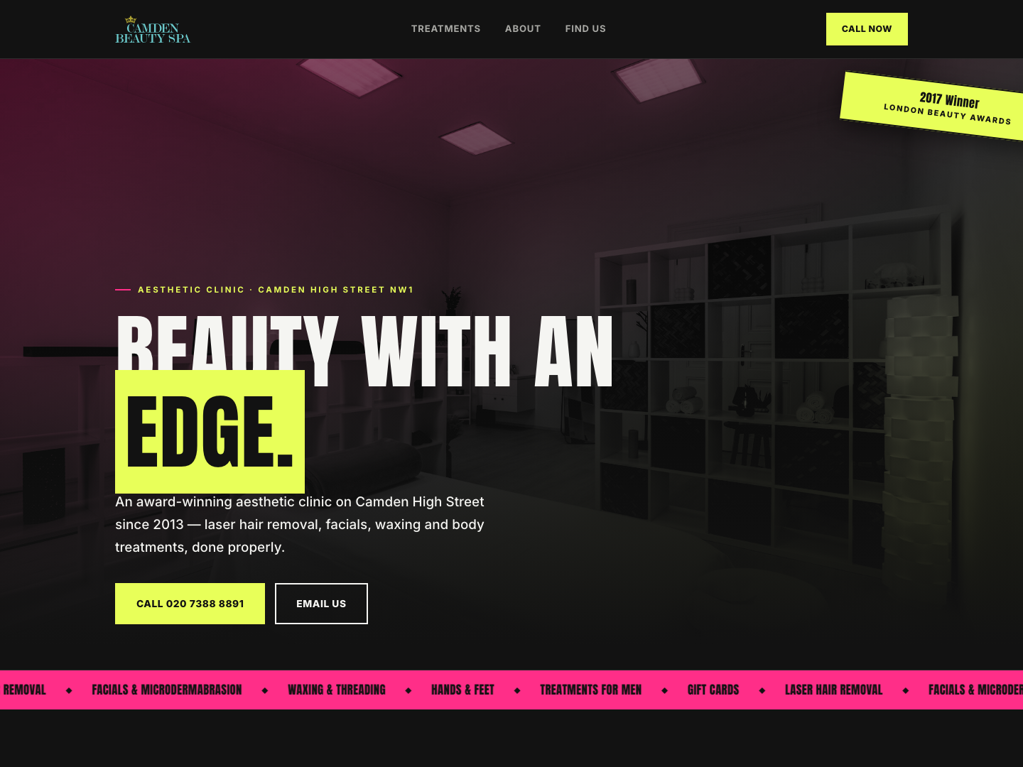
Poster hero
A dark, full-bleed hero with bold type, built around their real tagline rather than an invented headline.
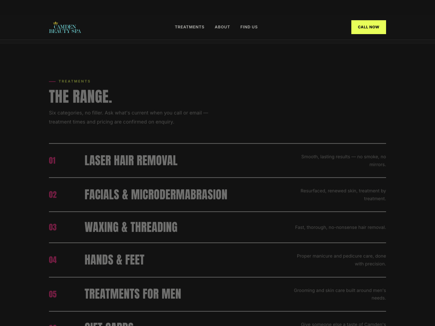
The Range
Six real treatment categories — laser hair removal to gift cards — as a bold numbered list instead of soft rounded cards.
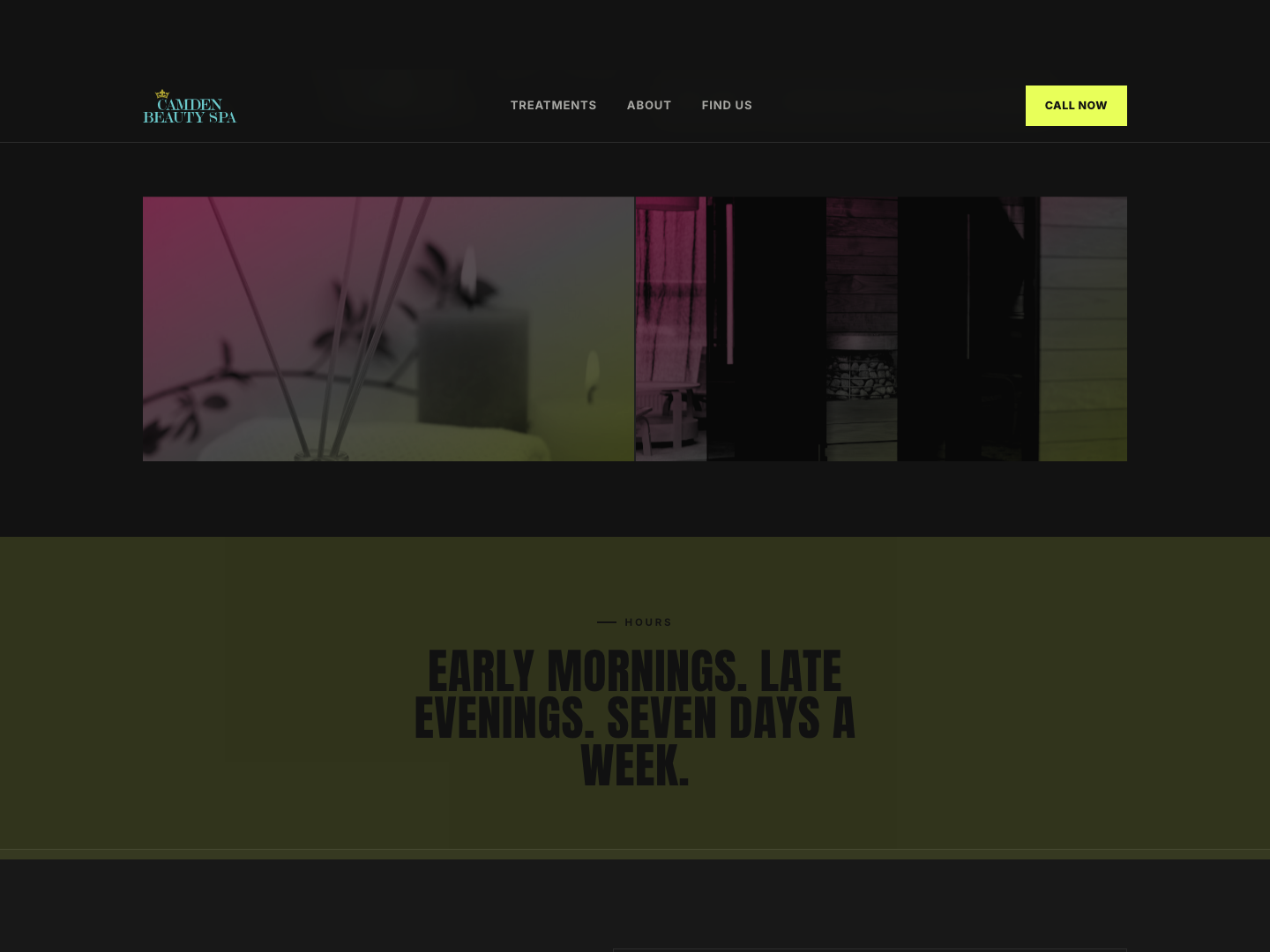
Hours, treated as a statement
"Early mornings, late evenings, seven days a week" — their real opening pattern — gets its own full-width band rather than a small-print footer line.
From first search to first day live.
What makes it work.
The real 2017 award, not an invented badge
The London Beauty Awards win is treated as an actual ribbon element rather than a generic "trusted by" strip.
Anton, for genuine poster weight
A bold condensed display face gives the clinic real presence instead of the quiet serif most spas reach for.
Dark, not pastel
Near-black with magenta and acid-yellow accents — closer to Camden's own market culture than a soft spa palette.
Their own tagline, given room to breathe
"Beauty goes beyond the surface" is set as a full pull-quote rather than getting lost in a paragraph.
Six categories, no filler
Every real treatment they offer, listed plainly, with no invented pricing since none was ever provided.
Hours as a headline
Their real "seven days a week" opening pattern is a genuine differentiator, so it's given the same visual weight as the hero.