A dashboard that tells the owner what to do next, not just what happened.
FOMOe already runs bookings and checkout for a real UAE spa group. We designed the next layer for the owner: one dashboard that surfaces revenue, today's schedule, client relationships and cash-close health — and tells you what actually needs attention today, not just a wall of numbers. Design exploration work, built on FOMOe's real pricing and operating model.
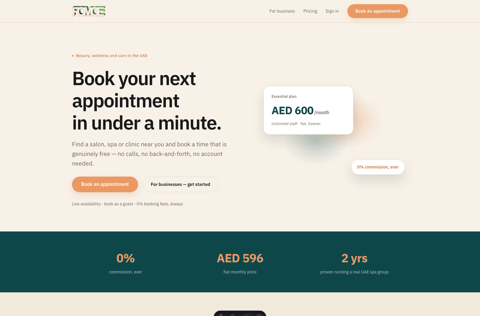
One platform, three jobs to do.
Overview
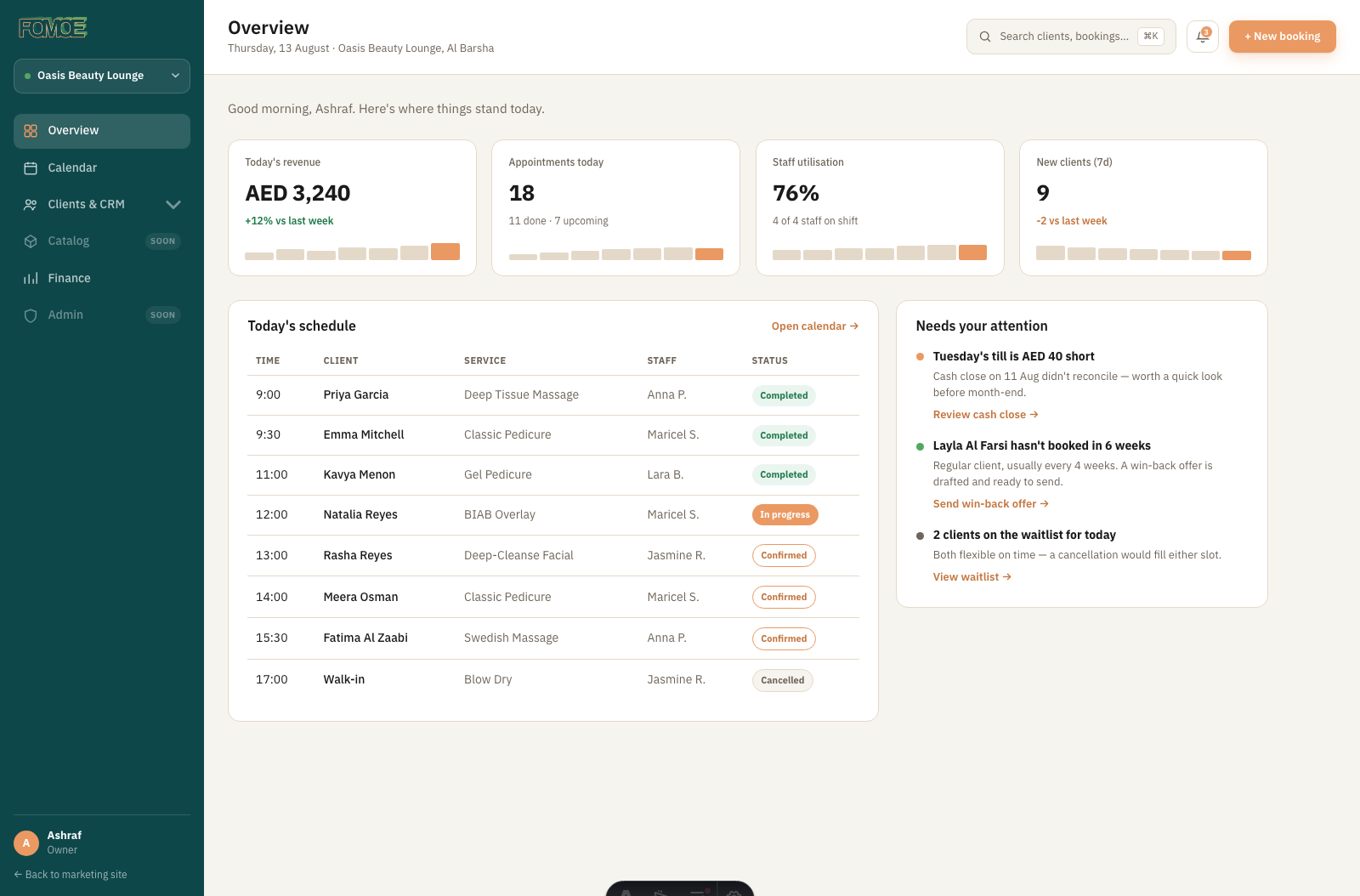
Today's revenue, appointments, staff utilisation and new clients as four live stat cards, the day's schedule, and a "Needs your attention" panel that turns raw activity into concrete next actions.
Clients & CRM
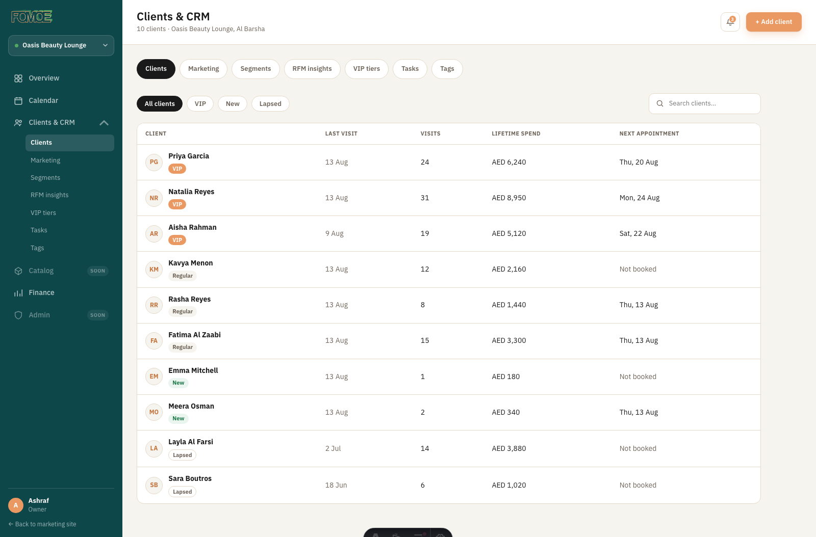
A client table with VIP / New / Lapsed status, visit count and lifetime spend at a glance, plus dedicated tabs for Marketing, Segments, RFM insights, Tasks and Tags — a workspace, not just a list.
Calendar
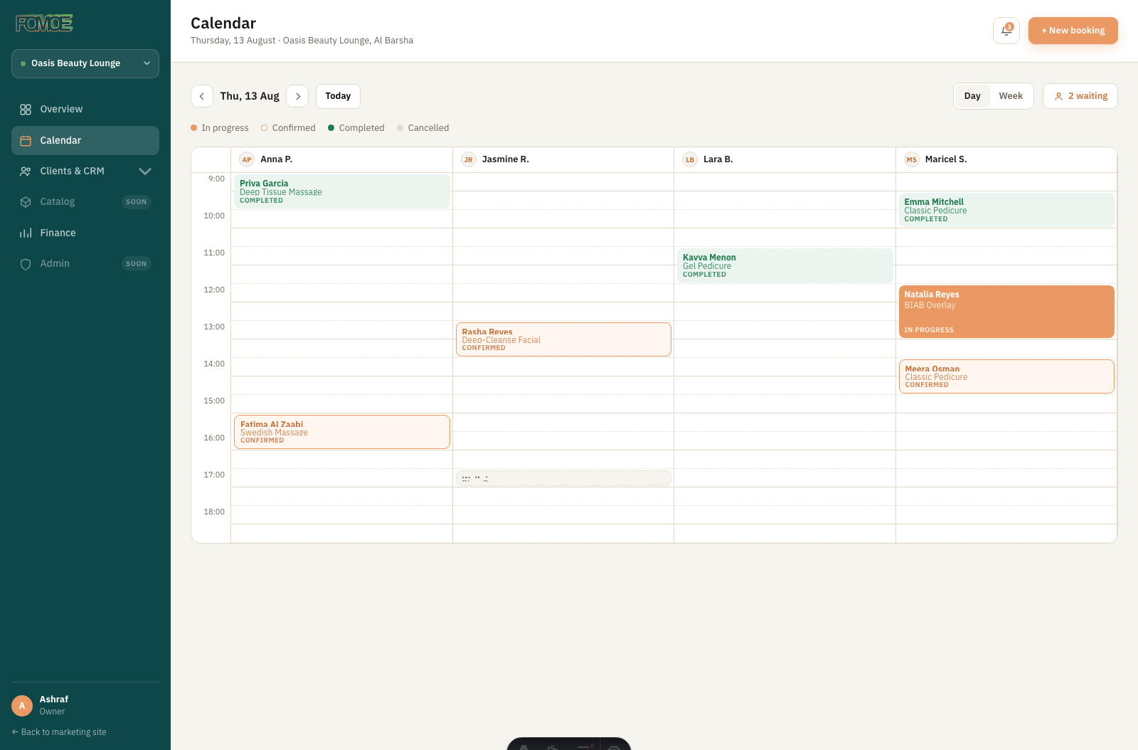
A day-view grid, one column per staff member, colour-coded by status (in progress, confirmed, completed, cancelled), with a live waitlist counter for walk-ins.
Finance
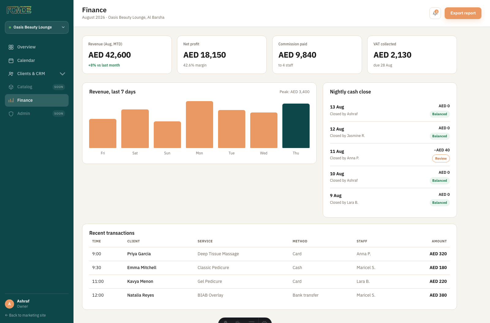
Month-to-date revenue, net profit, commission and VAT up top, a 7-day revenue chart, and a nightly cash-close log that flags the one night that didn't reconcile.
From first search to first day live.
What makes it work.
Tells you what to do, not just what happened
"Needs your attention" turns a AED 40 till shortage and a client who hasn't booked in six weeks into two specific actions — "Review cash close" and "Send win-back offer" — instead of leaving the owner to spot them in a report.
A win-back offer that's already drafted
The CRM doesn't just flag a lapsed client — the offer is ready to send. The gap between noticing and acting is one click.
Cash close that shows its work
Five nights of history with a plain "Balanced" badge, and the one night that's short stays visibly flagged "Review" until someone deals with it, instead of sitting buried in a report.
Status colour used sparingly, and consistently
Green for completed or balanced, orange for in-progress or needs review, muted grey for cancelled — the same logic holds across Calendar, Overview and Finance, so a colour means the same thing everywhere in the product.
CRM depth that doesn't feel bolted on
Marketing, Segments, RFM insights, Tasks and Tags sit as siblings of the client list itself, not a separate module — deeper analysis is one click from where the data already lives.
A warmer palette for a business tool
Sage green sidebar, warm cream canvas, terracotta accent — the same warmth as the marketing site, carried all the way into the daily-use dashboard instead of switching to generic SaaS grey once you log in.