A dead booking link, replaced by a room worth walking into.
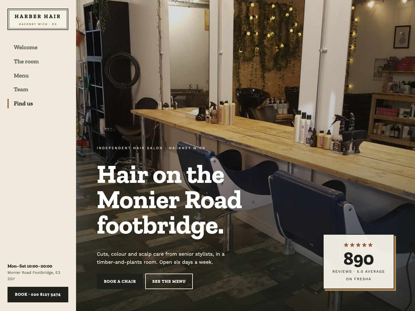
Harber Hair has 890 five-star reviews on Fresha, yet the website address on its listing shows a Site not found page. We built a concept around what the salon actually is: a timber-and-plants room on a footbridge, with prices laid out plainly and the team up front.
One platform, three jobs to do.
Editorial landing
The real room fills the first screen, with the review count set beside it.
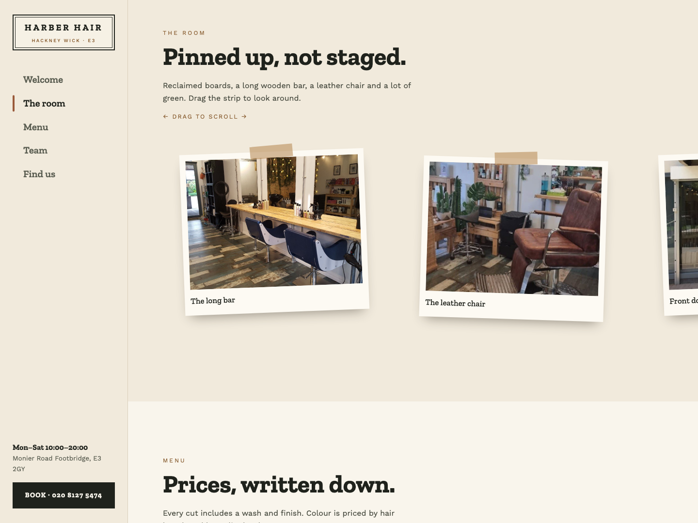
Pinned-up gallery
Photos of the salon as tilted, taped prints on a scrollable strip.
Written-down prices
A plain price list by stylist level, from their public Fresha listing.
From first search to first day live.
What makes it work.
Wordmark from the shop sign
No logo was published, so the double-ruled plate is recreated from the sign above the door.
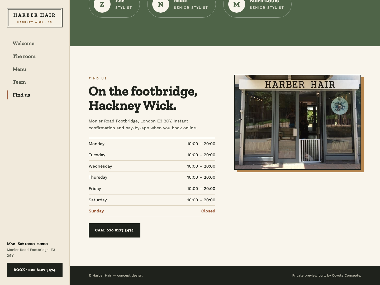
Side-rail navigation
A slim left rail with opening hours and a booking button always in view.
Zilla Slab and Work Sans
A sturdy slab serif that suits the workshop feel of the room.
Nothing invented
Prices, team and hours all come from the public listing.