A concept built on the salon's own black-and-gold brand, not an invented one.
The Little Nail Room already has a real identity — a black-and-gold logo, the tagline "Islington's neighbourhood beauty salon," and a genuinely charming real policy: "Dogs and drinks allowed!" With 4.8 stars from over 900 Treatwell reviews and six real gallery photos to work with, the brief was to build around what already existed rather than invent a new look — a black-and-gold concept with their real photography as the centrepiece.
One platform, three jobs to do.
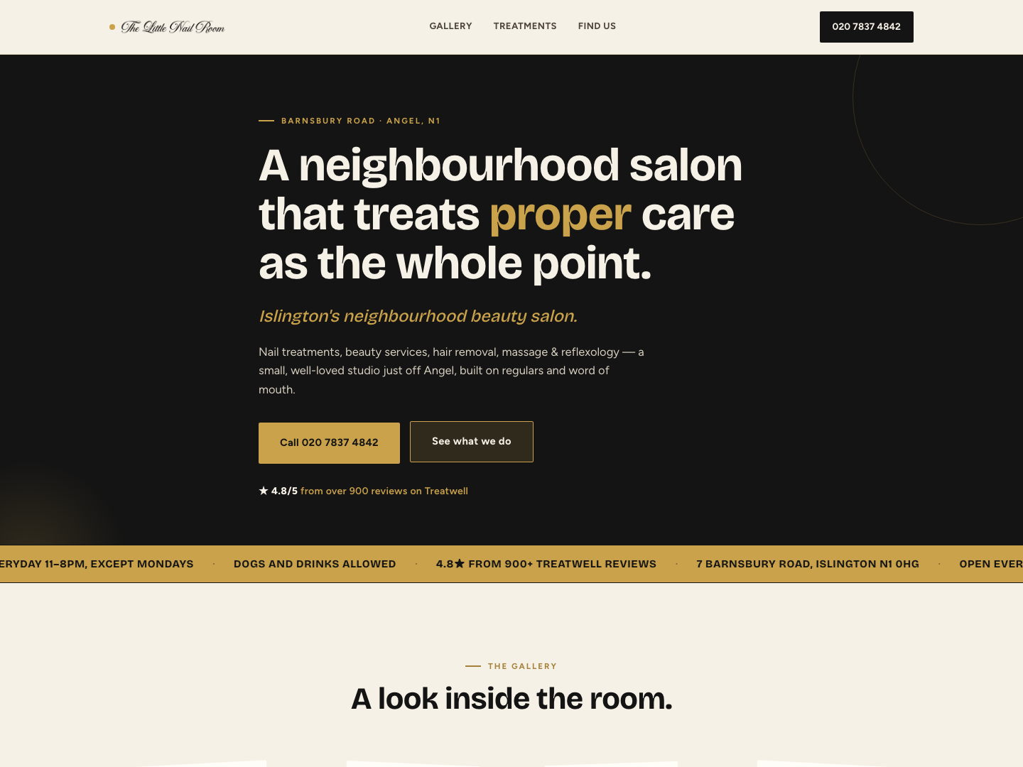
Black & gold hero
Built around their real logo colours rather than an invented palette, with their own tagline set as the opening line.
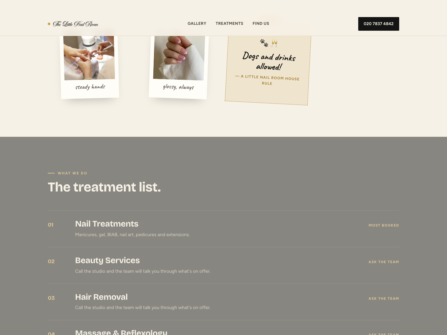
Polaroid gallery
Six real photos of their work, presented as a tilted Polaroid wall — the actual centrepiece of the page, not an afterthought strip.
The dog & drinks note
Their genuinely charming real policy, pinned in as a hand-written note card rather than buried in the footer.
From first search to first day live.
What makes it work.
Their real logo, not a new one
Sourced directly from their own site — black and gold, used as the actual nav wordmark rather than a generic typed name.
A real tagline, kept verbatim
"Islington's neighbourhood beauty salon" is their own line, used exactly as written.
Six real photos, not stock
The gallery uses their actual nail-art photography, tilted and captioned like a Polaroid wall instead of a plain grid.
A genuinely charming detail, featured
"Dogs and drinks allowed!" is real and distinctive, so it's given a handwritten-style callout instead of one buried line.
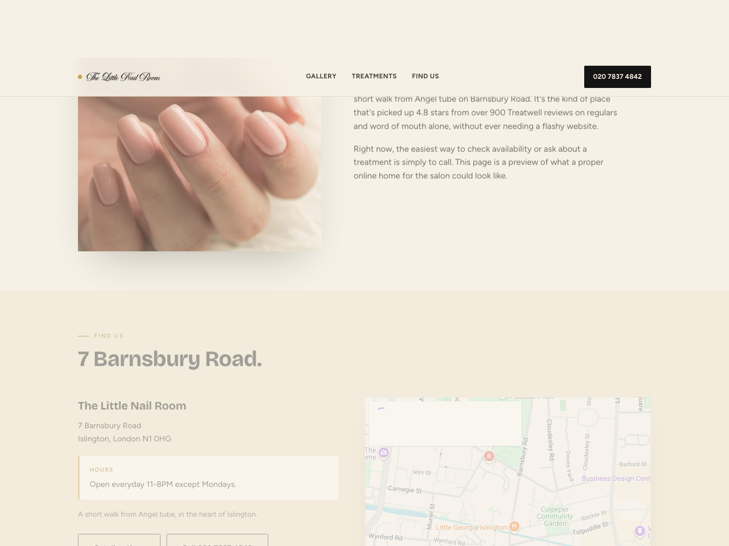
Real hours, stated plainly
"Open everyday 11-8PM except Mondays" — their own wording — used exactly as published.
Bricolage Grotesque for a confident, modern feel
A distinctive display face gives the brand presence without drifting into the pastel-cute look that doesn't match their actual black-and-gold identity.