A drop page for a barbershop that's already outgrown its own paperwork.
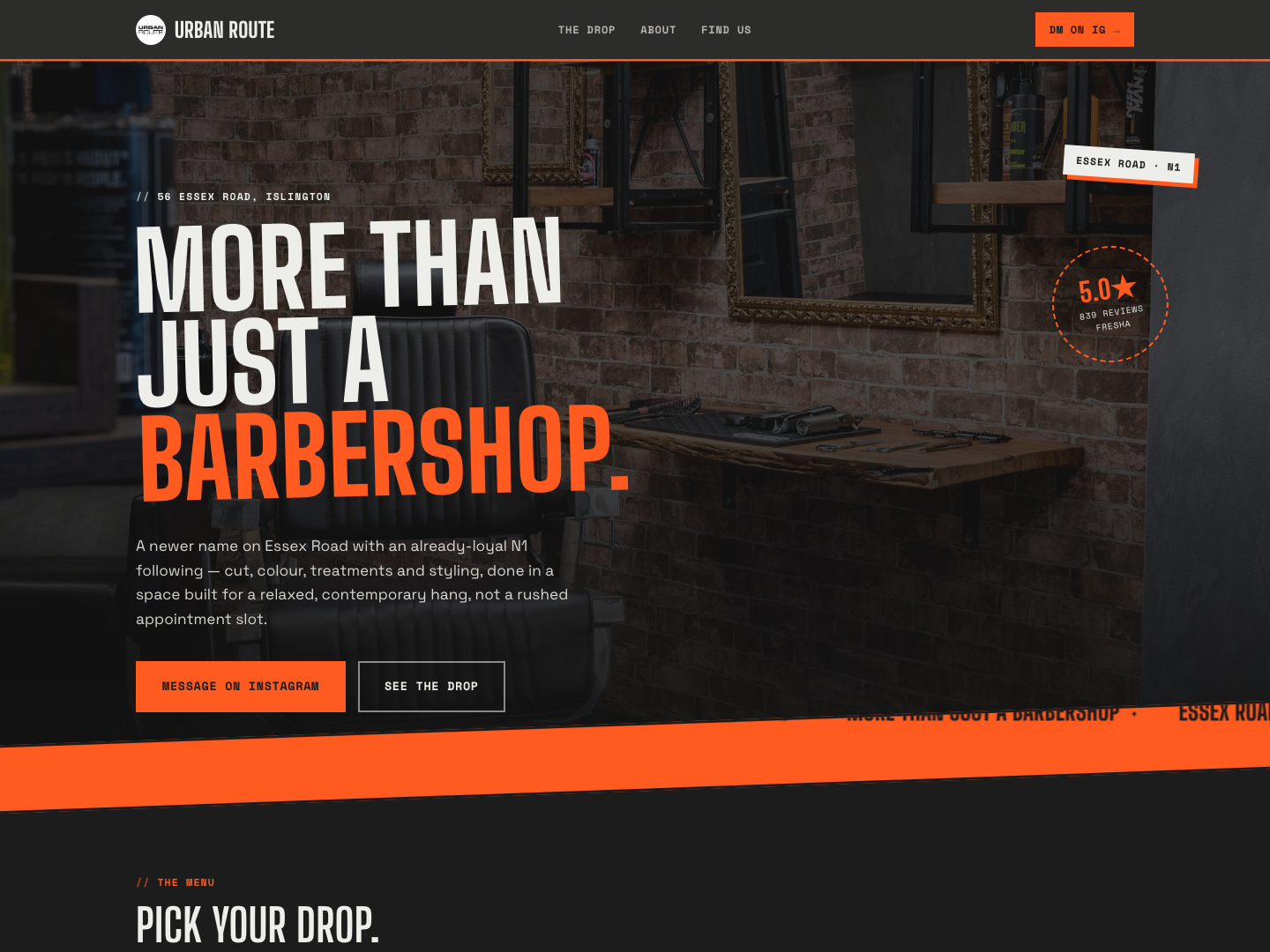
Urban Route has 839 reviews at 5.0 on Fresha and a real Instagram bio line worth building a whole page around — "MORE THAN JUST A BARBERSHOP." The shop is newly established on Essex Road but already has a loyal following and no site to send them to. We pitched a concept that reads like a streetwear label's drop page rather than a salon template: a scrolling marquee ticker, hangtag-style service cards, and a raw photo collage instead of the soft, rounded layout most barbershops default to.
One platform, three jobs to do.
Poster hero
Their own Instagram bio line as an oversized rotated headline, with a scrolling ticker reinforcing it underneath instead of a static trust strip.
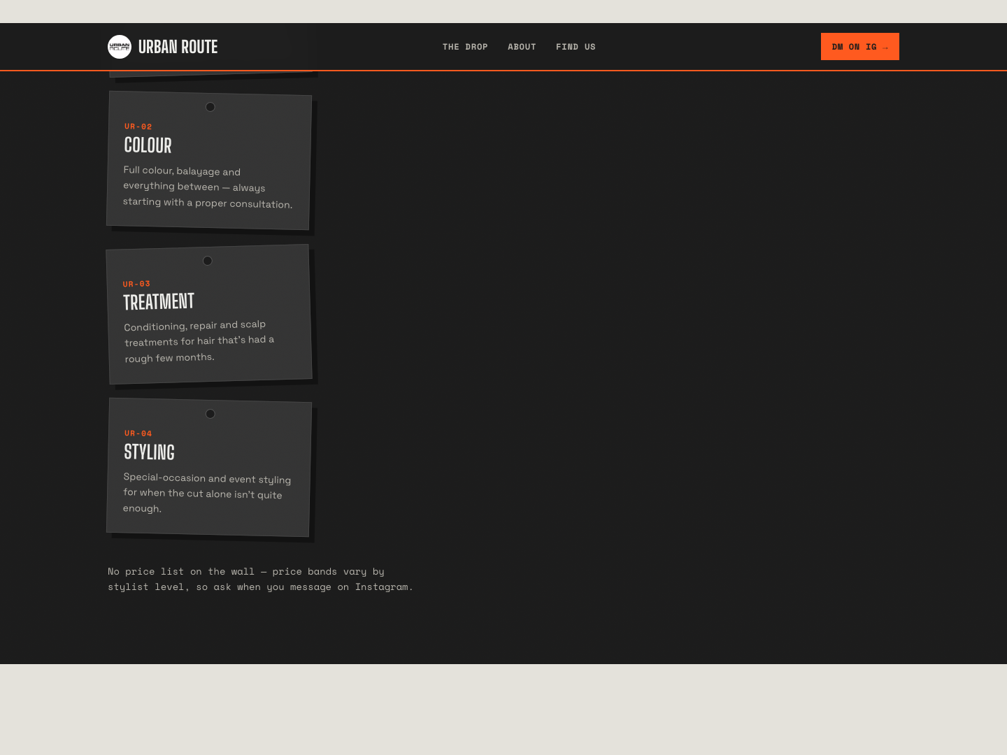
The drop
Four services styled as rotated SKU hangtags on a concrete panel — "UR-01" through "UR-04" — instead of a generic three-card grid.
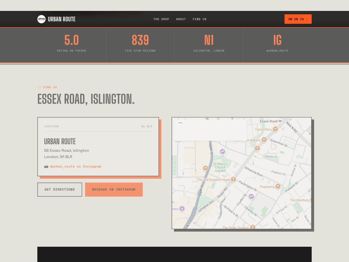
Find us
The Essex Road address, real hours and a direct line to their Instagram, since that's how the shop already takes bookings.
From first search to first day live.
What makes it work.
A real line, not an invented one
"MORE THAN JUST A BARBERSHOP" comes straight from their own Instagram bio — the whole page is built to earn that line, not just decorate it.
Big Shoulders Display, not a salon serif
A tall, condensed industrial face reads like a streetwear label, deliberately breaking from the script fonts most barbershop sites reach for.
A marquee, not a trust-badge row
Rating, review count and location loop as a moving ticker instead of sitting static — the one element on the page that never stops moving.
Hangtags instead of cards
Each service is a rotated SKU tag with a product-drop feel, not a rounded icon card like every barbershop within a mile.
Raw, not polished
Overlapping photos with hard shadows and a gaffer-tape label stand in for the clean, single framed photo most local sites use.
Concrete and acid orange, on purpose
A grittier palette than the rest of the batch — chosen because it matches a newer, harder-edged shop, not a soft neighbourhood salon.